Dashboard
Dashboard
The Dashboard section presents a quick overview of several categories of performance data for each function, over a specific period of time.
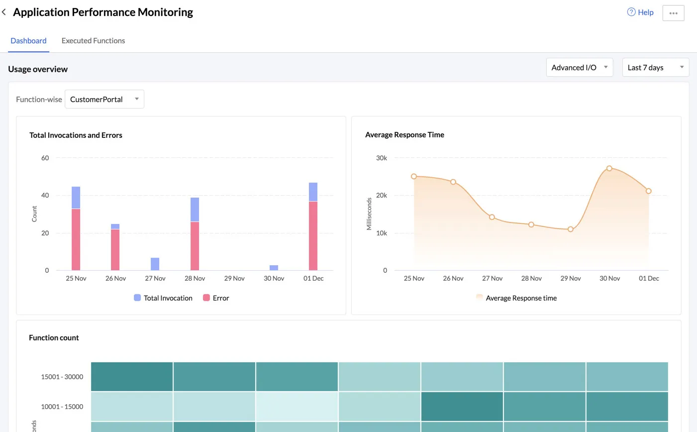
You must select the function and the time period from the dropdown lists in the section, to view populated graphs.
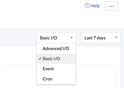
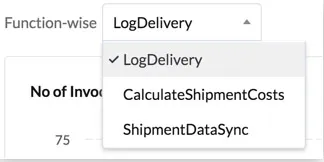
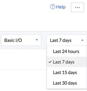
You must first select the type of function.
This will list all functions of that type that have been deployed to the console in your project. Select a function.
You can select one of the following time periods:
| Time Period Value | Range |
|---|---|
| Last 24 hours | Fetches and displays data of each hour, from an exact 24 hour window. For example, if you click on Last 24 Hours at 16:03:24, the data fetched will be from 16:03:24 of the previous day. However, the graphs will appear to display the data from the beginning of the hour, i.e., from 16:00:00 hours of the previous day, for a simpler visual presentation. |
| Last 7 days | Fetches and displays an overall report of each day, of the last 7 days This includes the present day until the current second, and the previous 6 days starting at 12:00:00 AM on the first day. |
| Last 15 days | Fetches and displays an overall report of each day, of the last 15 days This includes the present day until the current second, and the previous 14 days starting at 12:00:00 AM on the first day. |
| Last 30 days | Fetches and displays an overall report of each day, of the last 30 days This includes the present day until the current second, and the previous 29 days starting at 12:00:00 AM on the first day. |
This section displays the following graphs:
- Invocation/Error: This graph provides details about the total number of invocations and error invocations of the function on each day or hour, based on the selected time period.
-
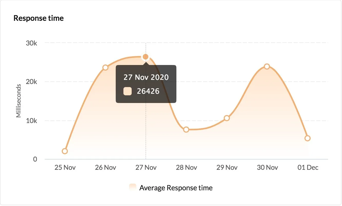
Response Time: This graph provides the average response time of the function on each day or hour, based on the selected time period.
-
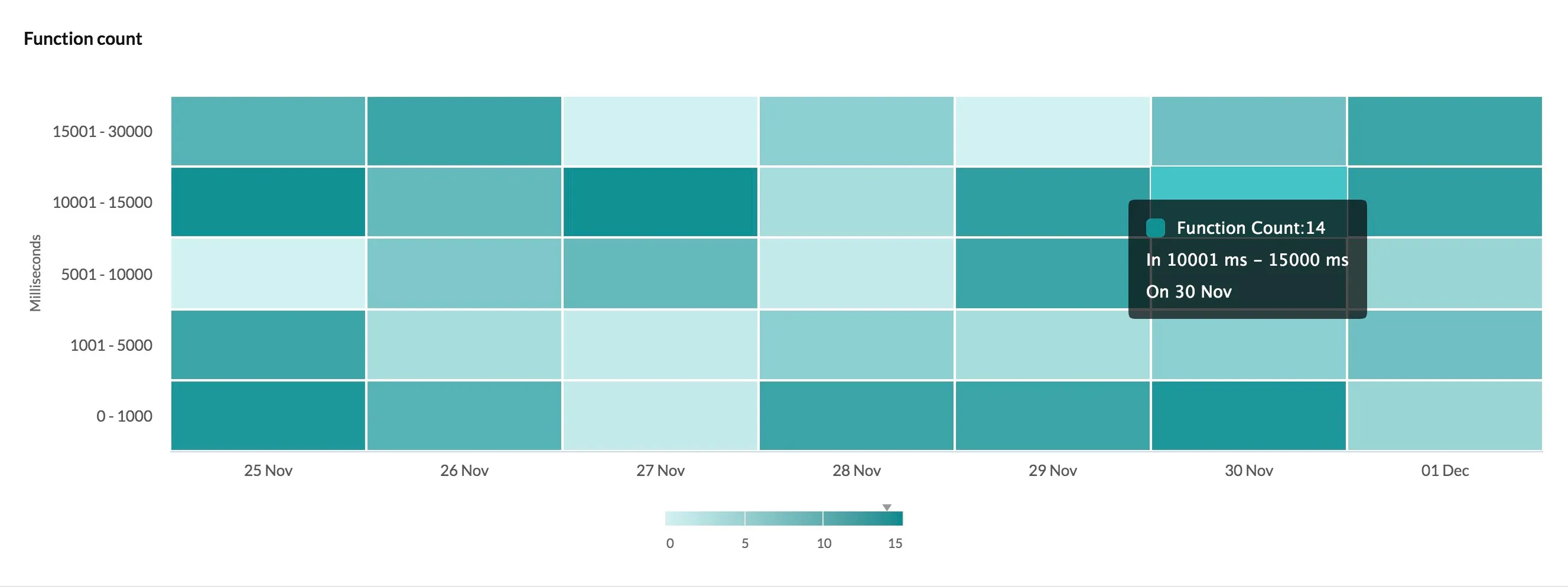
Function Count: This graph presents the correlation between the invocation count and execution time of the function on each day or hour, based on the selected time period.
The Dashboard section also displays a list of the Top 100 Slowest Calls, sorted in a descending order of response time.
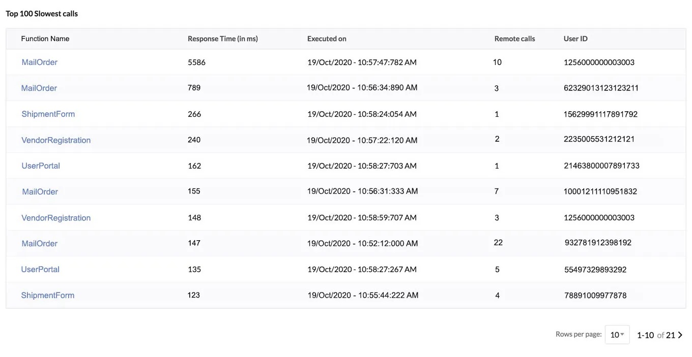
The table displays the top hundred slowest calls of all functions of the type and time period you select from the dropdown lists on the top. It does not list the executions of a specific function.
The table also shows other metadata of the execution, as seen in the picture, such as the response time in milliseconds, the number of times it was called remotely, and the User ID of the end-user who invoked the function.
You can choose the number of rows to display per page from the dropdown list below.
You can click on a function to navigate to the function’s details page.
Last Updated 2025-02-19 15:51:40 +0530 IST
Yes
No
Send your feedback to us