Clustering
Introduction
Clustering is a process of grouping similar data points into meaningful clusters, where items in the same group share common characteristics while differing from items in other groups. It falls under the domain of unsupervised learning, a branch of machine learning that works without predefined labels or outcomes. Instead of being told what the correct groupings are, the algorithm uncovers hidden structures within the data on its own. This makes clustering especially valuable when dealing with large, unorganized datasets, helping users detect patterns, discover natural groupings, and simplify complex information into more understandable segments.
At its core, clustering answers the question: “Which data points are similar to each other?” It can be applied across domains such as customer segmentation, image recognition, anomaly detection, and document categorization, among many others.
Building Intuition Behind Clustering
Before diving into types of clustering and its algorithms, let’s begin with an intuitive understanding of clustering. Imagine you have a dataset of movie viewers, with each viewer described by multiple attributes such as the number of movies watched per genre, average rating given, and watch frequency. You don’t know in advance which viewers have similar tastes.
By applying a clustering algorithm, each viewer is assigned to a cluster based on overall similarity across all features. At the end, you can visually see natural groupings of viewers: one cluster might contain fans of action and thriller movies, another could be comedy enthusiasts, and a third could represent viewers who prefer romance or drama. The algorithm has uncovered hidden patterns in viewer behavior without ever being told which viewers are similar.
Key Success Criteria for Clustering Analysis
Clustering is inherently iterative and exploratory, requiring domain expertise and human judgment. Unlike supervised learning, there are no labeled outcomes, so you cannot use traditional metrics like accuracy or RMSE to evaluate performance. This makes assessing clustering models subjective and dependent on business objectives.
Key criteria for success include:
-
Interpretability: Can you explain why points were grouped together?
-
Business usefulness: Does the clustering output provide actionable insights?
-
Knowledge discovery: Have you learned new patterns or uncovered hidden structures in the data?
Success in clustering often comes from combining algorithmic output with domain knowledge to refine clusters and extract meaningful insights.
Business Applications of Clustering
Clustering finds applications in a wide range of industries, such as those listed below, because it helps reveal natural groupings in data that businesses can act upon.
Retail and Marketing
Clustering is widely used in retail and marketing to segment customers into groups, such as budget shoppers, seasonal buyers, or premium customers. These insights allow businesses to run targeted campaigns, design loyalty programs, and even optimize store layouts by identifying products that are frequently purchased together.
E-commerce and Online Platforms
E-commerce platforms rely heavily on clustering for personalization. By analyzing browsing and purchase histories, clustering algorithms can group users with similar behavior and generate product recommendations tailored to each segment. Beyond customers, clustering also helps organize vast product catalogs into categories, while unusual browsing or review patterns can be flagged as suspicious activity.
Finance and Banking
In the financial sector, clustering plays a key role in fraud detection by distinguishing normal transaction clusters from rare, isolated outliers that may represent fraudulent activity. Banks also use clustering to segment clients based on spending patterns and income levels, enabling them to design customized credit cards, loan offers, or investment portfolios. Similarly, analysts use clustering to group stocks that behave alike in the market, aiding in portfolio diversification.
Healthcare and Life Sciences
Healthcare and life sciences also benefit from clustering techniques. Patient records can be grouped to identify disease subtypes or high-risk populations, which supports early intervention and personalized treatment plans. Genetic and clinical data, when clustered, often reveal hidden biological groupings that accelerate drug discovery. Hospitals also use clustering to categorize patients by treatment costs, hospital stays, or outcomes, helping improve operational efficiency.
Telecom and Technology
Telecom companies apply clustering to understand user behavior, such as grouping customers by calling or internet usage patterns, which then informs the creation of personalized data plans. It is also used to detect anomalies in network traffic or to streamline customer service by automatically grouping support tickets into categories like billing, login issues, or technical faults.
How Clustering Works
Let’s understand clustering using the K-Means algorithm, one of the most widely used methods.
Step 1: Choose the number of clusters (k)
The process begins by deciding how many clusters you want the algorithm to identify. This number, denoted as k, can be determined based on statistical techniques such as the Elbow Method which help estimate an optimal balance between accuracy and interoperability.
Step 2: Initialize centroids
Next, the algorithm randomly selects k data points from the dataset as the initial cluster centroids. These serve as the starting reference points around which clusters will begin to form. In some cases, improved initialization methods like K-Means++ are used to select better starting positions, which can help the algorithm converge faster and produce more reliable results.
Step 3: Assign data points to clusters
Once the centroids are initialized, each data point in the dataset is assigned to the nearest centroid based on a chosen distance metric, Euclidean distance, which measures how far apart two points are in space.
The formula for Euclidean distance between two points (x1,y1) and (x2,y2) is:
Distance = √((x1 - x2)² + (y1 - y2)²) where (x1,y1) and (x2,y2) are the coordinates of two points.
This step effectively divides the dataset into k groups, where each point belongs to the cluster with the closest centroid.
Step 4: Update centroids
After all points have been assigned, the algorithm recalculates the position of each centroid. This is done by taking the mean of all the data points that belong to the same cluster. The new mean value becomes the updated centroid location, representing the center of that cluster more accurately than before.
Step 5: Repeat assignment and update
The process of assigning points and updating centroids is repeated iteratively. With each iteration, the centroids adjust their positions slightly, and points may shift between clusters as the algorithm refines the boundaries. This cycle continues until the cluster assignments no longer change significantly or the movement of centroids becomes minimal.
Step 6: Check for convergence
K-Means is said to have converged when the centroids stabilize, meaning they stop moving appreciably between iterations. Alternatively, the process may stop when a predefined maximum number of iterations is reached. At this stage, the algorithm considers the clustering process complete.
Step 7: Generate the final output
In the final step, each data point is assigned a cluster label (such as 0, 1, 2, …, k–1) corresponding to the group it belongs to. The final centroid coordinates represent the centers of these clusters. These results can then be used for real-time use cases such as customer segmentation.
Example
Let’s apply these steps to a customer segmentation example for a better understanding.
Imagine you run an online store and have a dataset of customers with multiple attributes, such as monthly spending, number of purchases, product preferences, and more. You don’t know in advance which customers behave similarly.
After applying a clustering algorithm, such as K-Means, each customer is assigned to a cluster based on overall similarity across all features. To visualize the results, the data is reduced to two components: Component 1 and Component 2.
Each customer becomes a point on a 2D scatter plot:
- X-axis: Component 1
- Y-axis: Component 2
Points are color-coded according to their cluster. This visualization makes it easy to see natural groupings of customers.
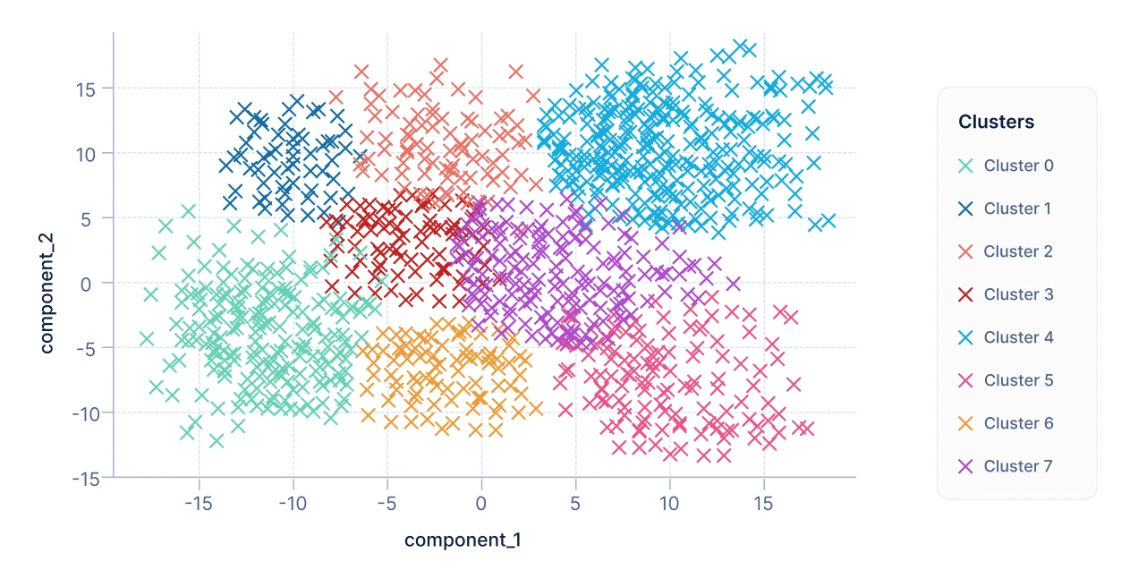
From the above plot, we can conclude that each cluster formed represents a group of customers with similar attributes and interests. And business can target these customer segments to increase the revenue and profits.
K-Means is one algorithm falls under centroid based clustering. QuickML also supports various algorithms that fall under different types of clustering. Let’s have a look at the types of clustering.
Types of Clustering
Clustering methods can be broadly classified into four major types, each with its own approach and applications.
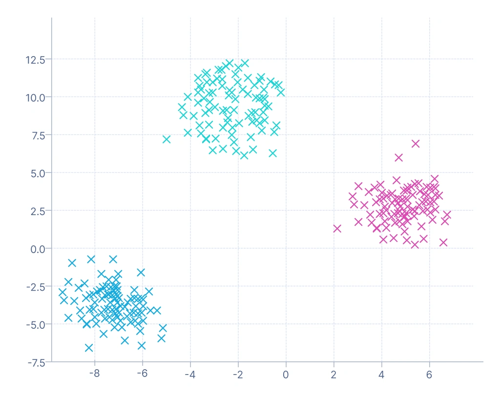
1. Centroid-based clustering: It relies on a central point, or centroid, to represent each cluster. Data points are assigned to the cluster whose centroid they are closest to, with clusters formed by minimizing the distance between data points and these centroids. A common example is customer segmentation, where shoppers are grouped into categories like budget, mid-range, or premium based on their average monthly spending.
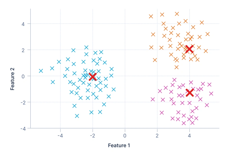
In this visualization, the data points are grouped around centroids — the red X markers represent these centroids. Each color indicates a distinct cluster, and every point belongs to the cluster whose centroid it’s closest to. The goal is to minimize the total distance between points and their assigned centroids. This method assumes clusters are roughly spherical and equally sized, which works well for simple, well-separated data distributions. Algorithms like K-Means and MiniBatchKMeans are examples of centroid-based clustering.
2. Medoid-based clustering: It is similar to centroid but instead of using calculated centroids, it chooses actual data points, called medoids, as cluster representatives. This makes the approach more robust to noise and outliers, since the clusters are anchored on real observations. For instance, telecom companies may use medoid-based clustering to group users by selecting actual representative customer profiles from call behavior data.
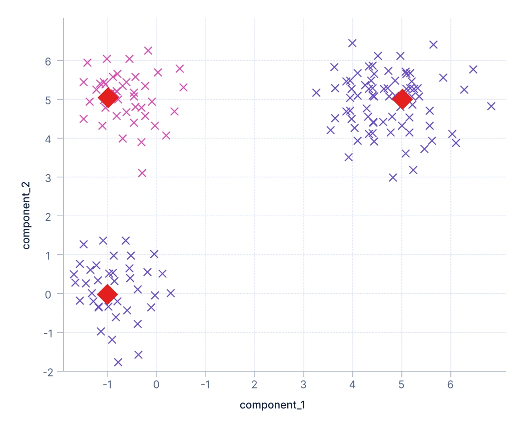
Here, clusters are represented by medoids — actual data points shown as red diamond markers. Unlike centroids (which are averages), medoids are real observations from the dataset that minimize the total dissimilarity to other points in their cluster. This makes the approach more robust to noise and outliers since extreme values have less influence on the cluster centers. The plot shows how clusters are formed around representative data points. Algorithms like K-Medoids, CLARA, and CLARANS follow this principle.
3. Density-based clustering: It takes a different path by identifying dense regions of data points and treating them as clusters, while areas of low density act as separators. One of its strengths is the natural detection of outliers, since points that don’t belong to any dense region are marked as noise. A typical application is in financial fraud detection, where dense regions correspond to normal spending behavior and sparse or isolated points indicate suspicious transactions.
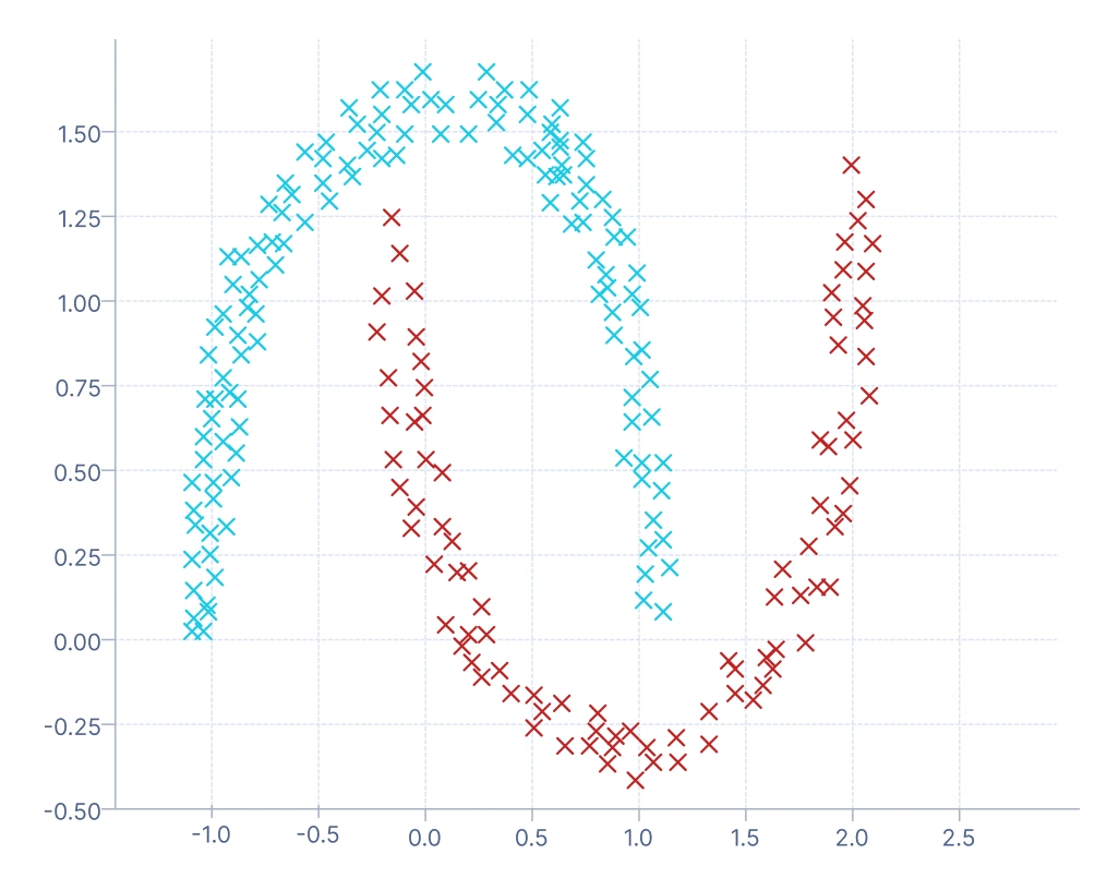
In this plot, clusters are formed based on regions of high data density. The algorithm groups points that are close together and labels points in low-density regions as noise (often marked in a different color, such as -1 in DBSCAN). You can see that this approach captures complex, non-spherical cluster shapes (like the curved “two moons” pattern), which centroid or medoid-based methods struggle with. It’s ideal for datasets with irregular boundaries or when detecting outliers is important — for example, in fraud or anomaly detection.
4. Model-based clustering: It assumes that data is generated from a mixture of underlying probability distributions, and it assigns probabilities of cluster membership rather than hard labels (each data point is assigned to exactly one cluster, like in K-Means). This probabilistic framework makes it especially useful in complex domains such as speech recognition, where overlapping sound patterns can be modeled as a mixture of Gaussian distributions.
This visualization shows clusters formed by modeling the data as a mixture of Gaussian distributions. Each cluster corresponds to one Gaussian component, and data points have probabilistic membership — meaning a point can partially belong to multiple clusters. The colors indicate the most likely cluster assignment for each point. This method handles overlapping and elliptical clusters better than K-Means, making it suitable for more complex, continuous data distributions.
Steps to Build a Clustering Pipeline in QuickML
Building a clustering pipeline in QuickML uses Classic Builder, which ensures accurate identification of clusters and actionable insights.
Step 1: Data ingestion
The process begins with loading the dataset into QuickML, which serves as the foundation for the clustering workflow. This step involves importing data from various sources such as CSV files, databases, or cloud storage systems.
Step 2: Data preprocessing
Once the data is ingested, it undergoes a preprocessing phase to ensure quality and consistency. This step includes handling missing values through techniques like imputation or removal, encoding categorical variables using methods like label or one-hot encoding, and applying data transformation techniques to improve data quality and model performance. Effective preprocessing reduces bias and improves the accuracy of clustering by ensuring that distance-based algorithms treat all features fairly.
Step 3: Algorithm selection
After preprocessing, QuickML allows users to select an appropriate clustering algorithm based on the data characteristics and desired outcome. Algorithms such as K-Means, DBSCAN, BIRCH, or Gaussian Mixture Models (GMM) can be applied depending on whether the dataset has well-separated, density-based, or probabilistic cluster structures. The selection of the right algorithm is crucial, as different methods capture different types of relationships and structures within the data.
Step 4: Model training
In this step, the selected algorithm is applied to the processed data to identify natural groupings. The model iteratively learns by assigning similar data points to the same cluster based on the defined similarity or distance measure. Key parameters, such as the number of clusters in K-Means or the epsilon value in DBSCAN, are fine-tuned to produce meaningful and stable results. The outcome of this phase is the identification of distinct data clusters that reveal hidden patterns and structures within the dataset.
Step 5: Cluster evaluation
After clusters are formed, QuickML evaluates their quality and validity using various statistical metrics. Commonly used metrics include the Silhouette Score, which measures how well each data point fits within its cluster; the Calinski-Harabasz Score, which assesses cluster compactness and separation; and the Davies-Bouldin Score, which evaluates average cluster similarity. These evaluation metrics help in determining whether the clustering results are both interpretable and reliable for practical applications.
Clustering Evaluation Metrics
The evaluation metrics mentioned below collectively provide insights into different aspects of clustering model performance, such as how well the groups are separated, how compact they are, and whether the clusters reveal meaningful similarities in the data, rather than arbitrary groupings. Unlike supervised learning, clustering does not have predefined labels, so these metrics act as guiding measures to judge the quality of the clusters.
Let’s explore and interpret the metrics commonly used in evaluating clustering models in QuickML:
1. Silhouette Score
What it tells you: Measures how similar a data point is to its own cluster compared to other clusters.
Intuition:
- The silhouette score ranges from -1 to +1.
- A high score (close to +1) indicates that data points are well-clustered, with tight grouping and clear separation from other clusters.
- A score near 0 suggests overlapping clusters or points lying on the boundary between clusters.
- A negative score (close to -1) indicates poor clustering where points may be assigned to the wrong cluster or clusters overlap significantly.
Example Inference: If the silhouette score is 0.52, it means clusters are reasonably well-formed and separated, but there is still some overlap among data points.
2. Calinski-Harabasz Score
What it tells you: This score compares how far apart the clusters are (between-cluster dispersion) to how tight the points are within each cluster (within-cluster dispersion).
Intuition:
- The score is unbounded and ranges from -∞ to +∞. (higher is better).
- A higher score indicates clusters are compact within themselves and well-separated from others.
- A lower score suggests that clusters are either spread out internally or not distinctly separated.
Example Inference: If the Calinski-Harabasz score is 950, it suggests that the clusters are relatively dense and distinctly partitioned, showing a good separation structure.
3. Davies-Bouldin Score
What it tells you: Measures the average similarity between clusters, based on the ratio of intra-cluster distance to inter-cluster separation.
Intuition:
- The score ranges from -∞ to +∞ (lower is better).
- A lower score means clusters are more distinct and have less overlap.
- A higher score suggests significant similarity between clusters, implying poor separation.
Example Inference: If the Davies-Bouldin score is 0.60, it indicates the clusters are fairly well-separated, but not perfectly distinct — some overlap still exists.
4. Number of Clusters
Indicates how many distinct groups the algorithm has identified in the dataset.
Example Inference: If the model outputs 3 clusters, it suggests that the dataset can be meaningfully divided into three distinct groups, for example, three types of customer segments: budget, mid-range, and premium buyers.
Visual Evaluation of Clusters
Apart from numerical scores, cluster evaluation can also be done through visualization in QuickML. Cluster distribution and cluster plots give an intuitive sense of balance, separation, and structure within the data.
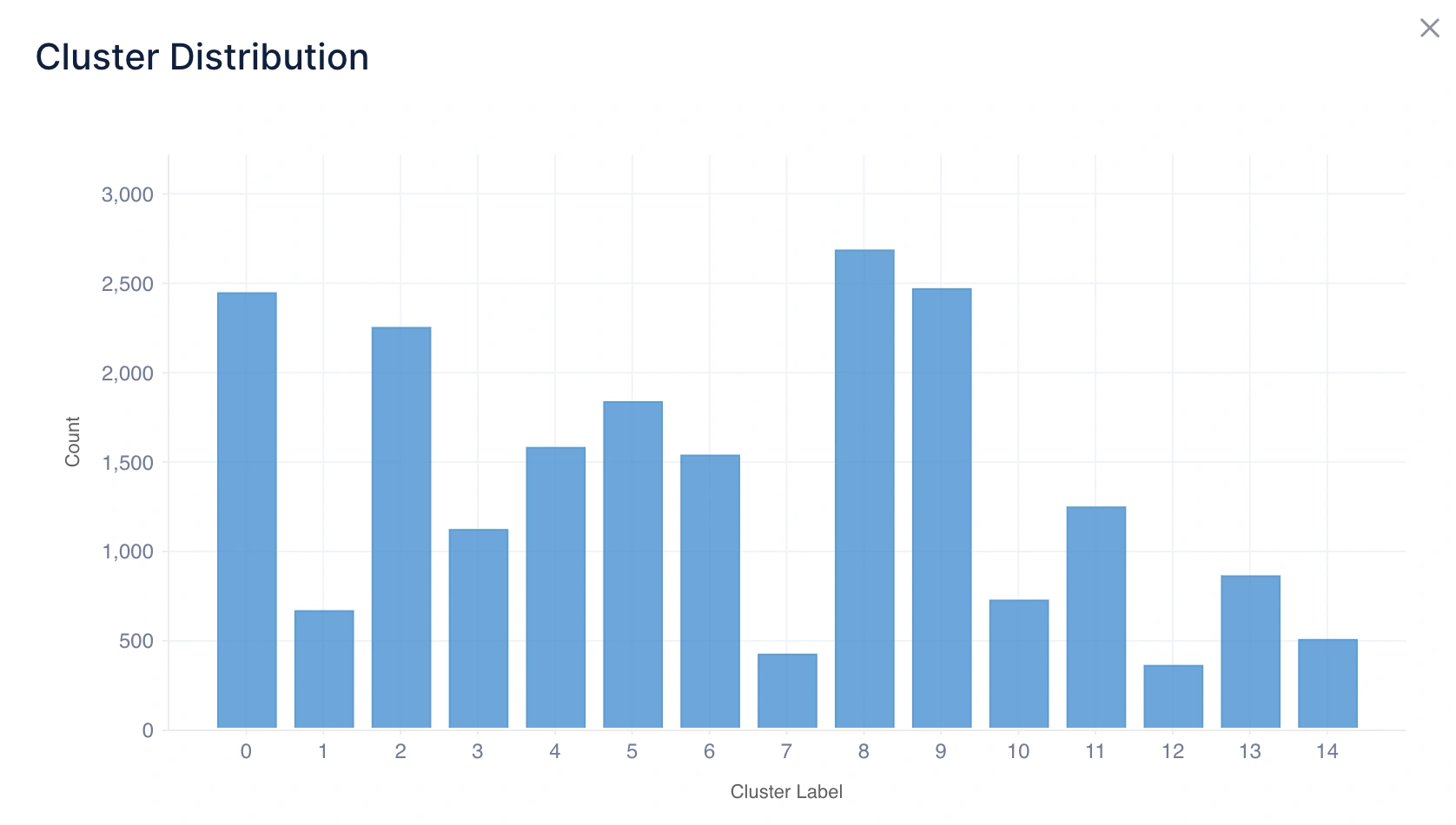
1. Cluster Distribution
What it tells you: This shows how many data points fall into each cluster using a histogram chart.
Intuition:
- A balanced distribution means clusters are relatively even in size, which often indicates a natural grouping.
- An imbalanced distribution means one or more clusters dominate in size, which may suggest either real-world dominance (e.g., most customers belong to one segment) or a limitation of the clustering method.
Example Inference: If Cluster 0 has 600 points, Cluster 1 has 150 points, and Cluster 2 has 30 points, it suggests that the majority of data points belong to Cluster 0, while Clusters 1 and 2 represent smaller, niche groups.
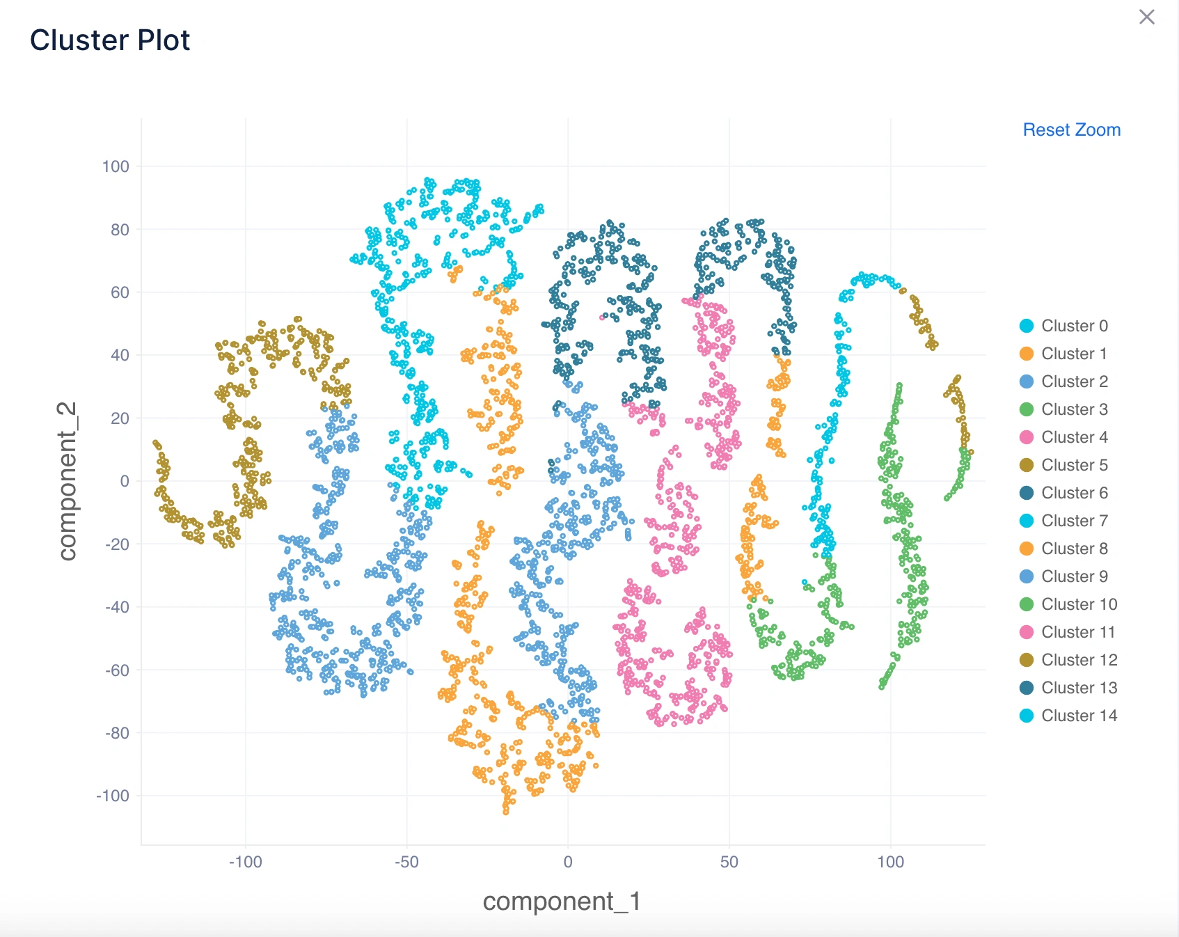
2. Cluster Plot
What it tells you: Visualizes how clusters are separated in a lower-dimensional space using a scatter plot (usually using PCA or t-SNE for dimensionality reduction).
Intuition:
- Well-separated clusters in the plot indicate good performance of the clustering algorithm.
- Overlapping clusters suggest ambiguity in assignments, meaning the algorithm found it difficult to clearly separate groups.
Example Inference: If the plot shows clearly visible groups with distinct boundaries, it confirms the algorithm has identified meaningful clusters. If groups overlap heavily, it suggests the need to test a different algorithm (e.g., DBSCAN for irregular shapes).
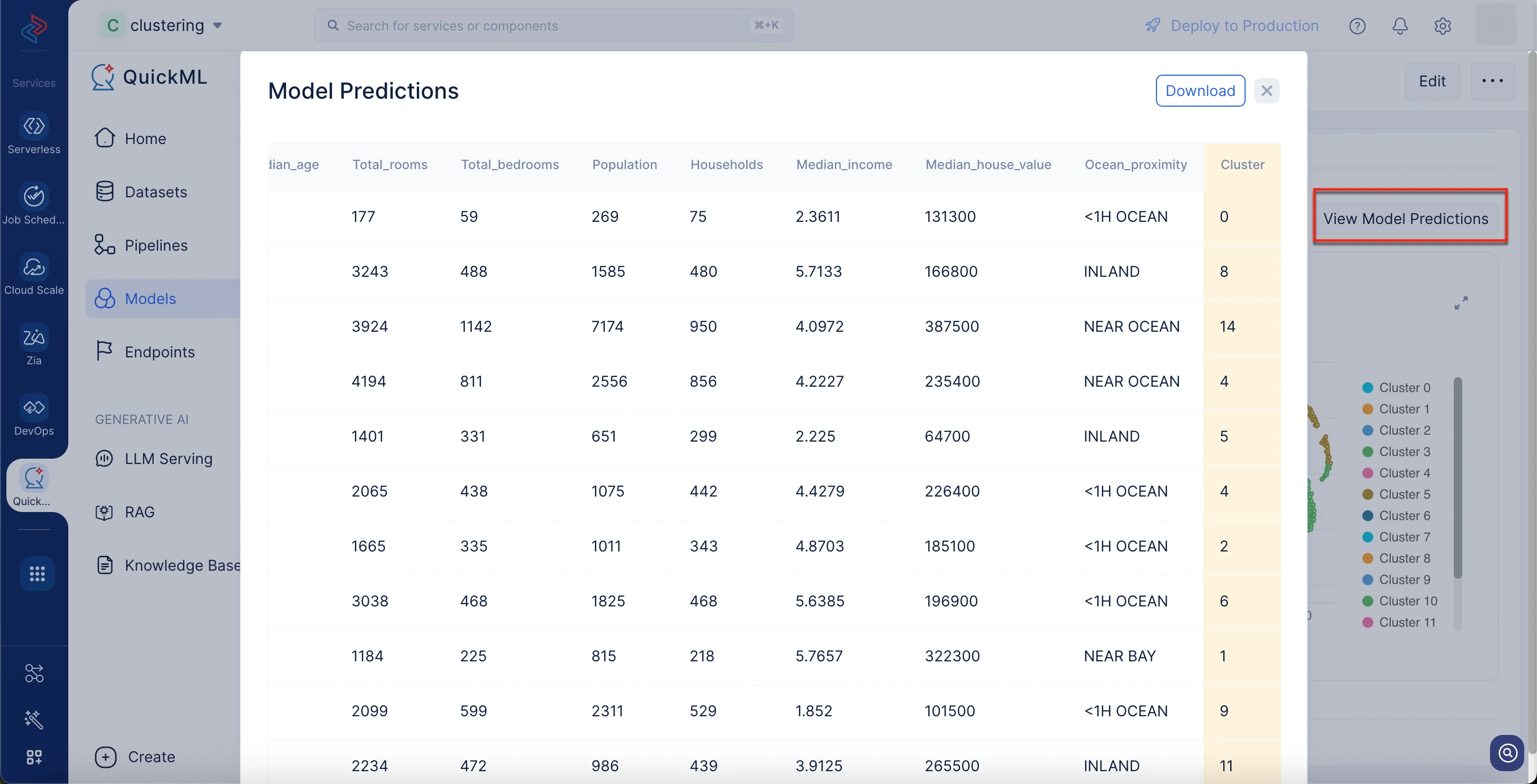
3. Download Model Predictions
What it tells you: This allows you to export the model’s clustering results for the entire dataset. Each data point is labeled with the cluster it belongs to.
Benefits:
- Provides a direct mapping of data points to clusters, making it easy to analyze individual assignments outside QuickML.
- Enables further downstream analysis, such as profiling clusters, cross-referencing with external data, or performing targeted actions (e.g., marketing to a specific customer segment).
- This offers transparency and traceability as you can see exactly which data points were assigned to which cluster, which is useful for validation and reporting.
To download model predictions
- Navigate to the desired model details page.
- Scroll down to the Visualizations section.
- Click View Model Predictions button above to the cluster plot chart.
A Model Predictions pop-up window appears from which you can download the predictions.
Last Updated 2025-10-27 11:52:49 +0530 IST
Yes
No
Send your feedback to us