Relationship Charts
Relationship charts are graphical representations used to visualize the connections, associations, or interactions between different entities or variables within a dataset. These charts help reveal patterns, dependencies, and correlations, making it easier to understand how various elements are related. Relationship charts are particularly useful for identifying trends, uncovering dependencies, and gaining insights into complex data structures.
-
Line Chart
A line chart is a graphical representation used to display trends, changes, or relationships within a dataset over time or along a continuous axis. It connects individual data points with lines, providing a visual depiction of how values evolve over a given period. Line charts are particularly effective for showing patterns, fluctuations, and comparisons between different data series.
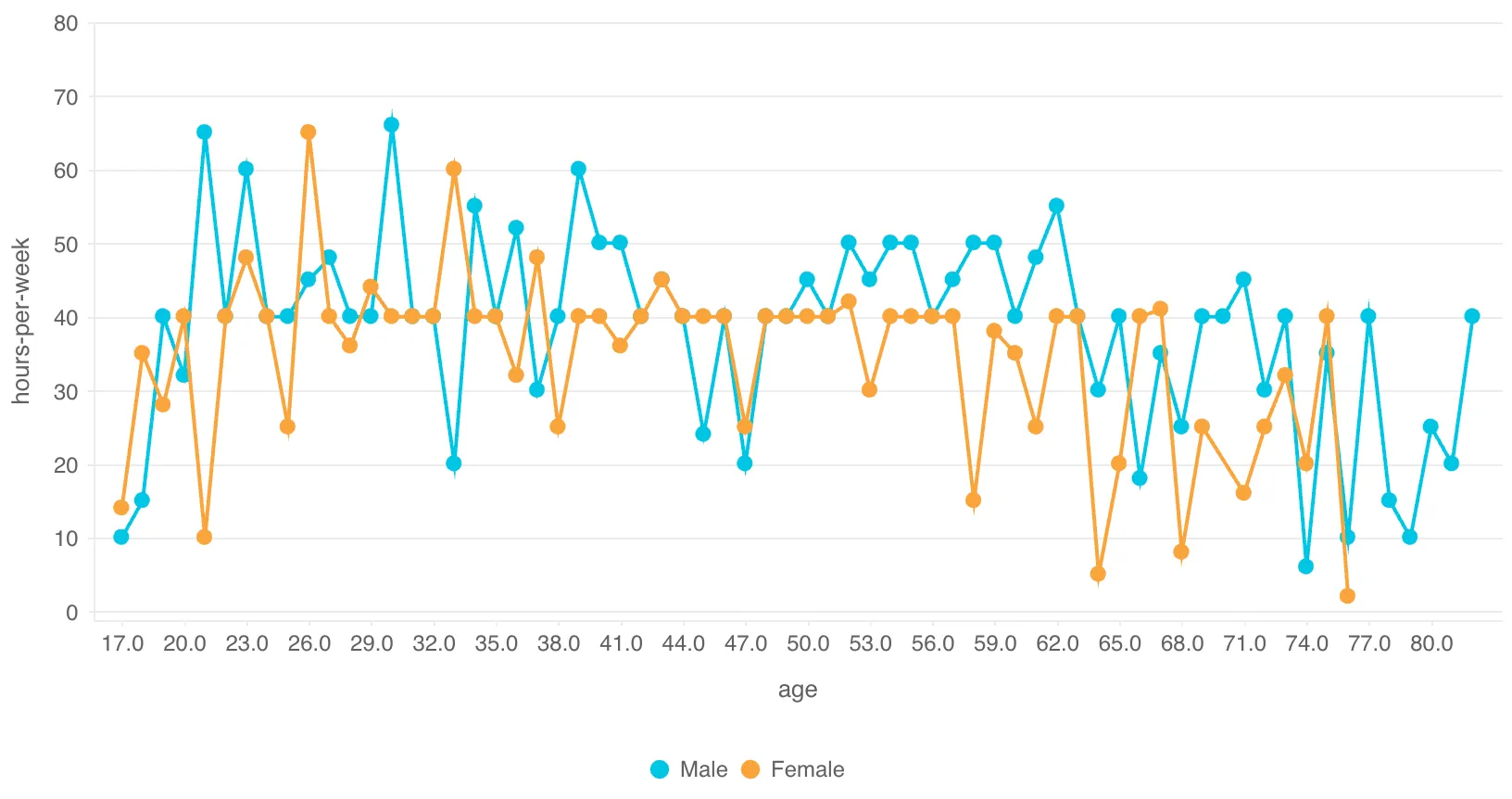
Description:
-
Connected Data Points: Data points are connected by lines, forming a continuous line that represents the trend or change.
-
Axes: The x-axis typically represents distinct categories or groups, or any other continuous variable. The y-axis represents the values associated with each category or group.
-
Trend Visualization: Line charts help visualize trends, fluctuations, or relationships within data over time or along a continuous axis.
-
-
Bubble Chart
A bubble chart is a graphical representation used to display three dimensions of data simultaneously. It adds a third variable to a scatter plot, where each data point is represented as a circle (or bubble) with its position determined by two variables (usually on the x and y axes) and its size determined by the third variable. Bubble charts are effective for visualizing relationships, comparing multiple dimensions, and understanding patterns within data.
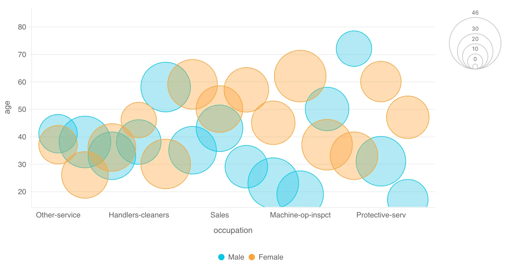
Description:
-
Bubbles: Each data point is represented by a circle (bubble) on the chart.
-
Position: The position of the bubble along the x and y axes represents the values of two variables.
-
Size: The size of the bubble represents the value of a third variable.
-
Color: The color of the bubble represents the group differences.
-
-
Heatmap
A heatmap chart is a graphical representation used to visualize the intensity or magnitude of values within a dataset by using color variations. It presents data in a grid format, where each cell is colored based on the value it represents. Heatmaps are effective for identifying patterns, trends, and variations within large datasets and making data-driven decisions based on visualized patterns.
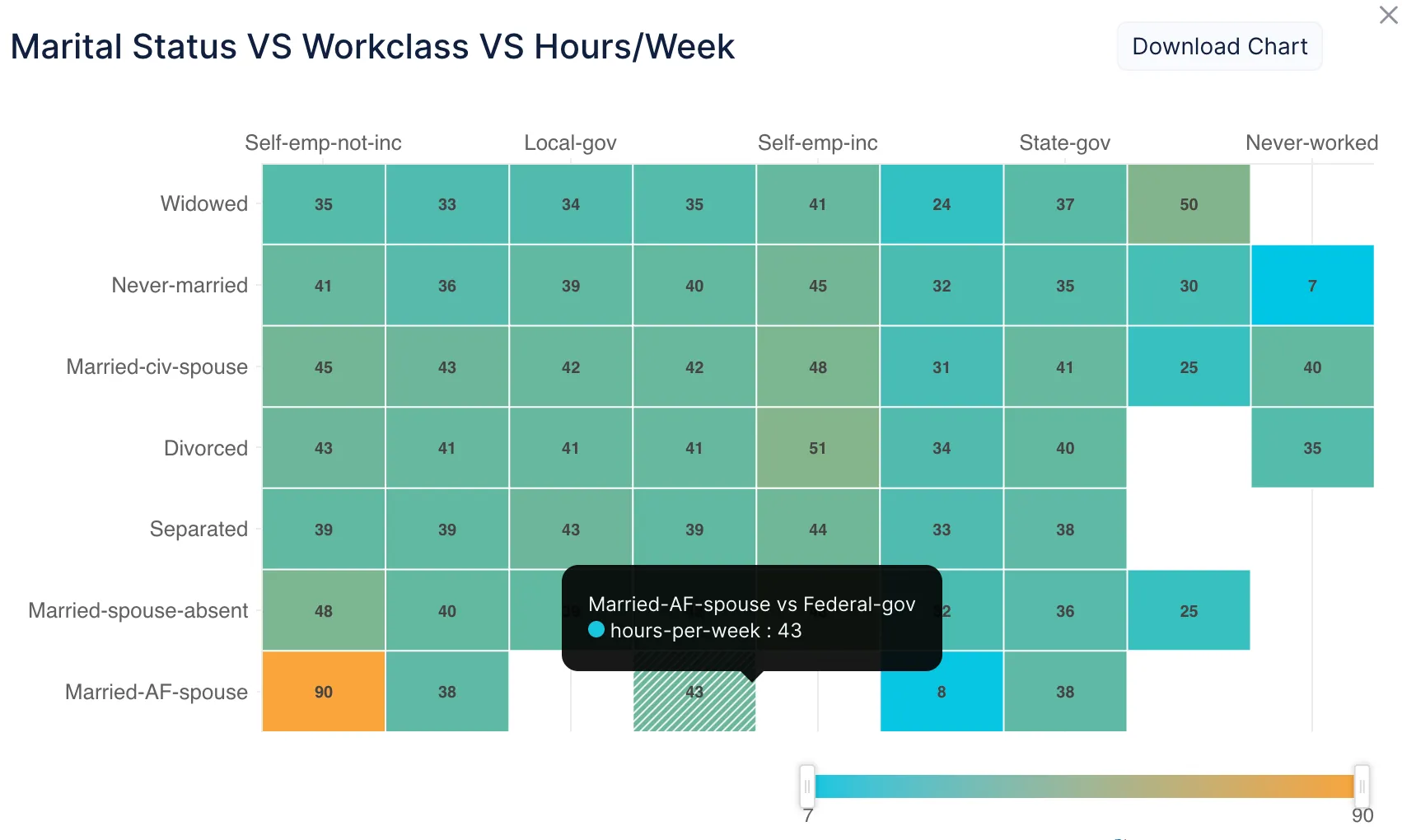
Description:
-
Color Mapping: Each cell in the grid is colored according to a color scale, with the color intensity representing the value’s magnitude.
-
Two-Dimensional Grid: The data is organized in rows and columns, forming a grid where each cell represents a specific value.
-
Pattern Detection: Heatmaps help detect patterns, correlations, and anomalies by visually highlighting areas of high or low values.
-
Last Updated 2025-02-19 15:51:40 +0530 IST
Yes
No
Send your feedback to us