Distribution Charts
Distribution charts are graphical representations used to visualize the frequency or distribution of values within a dataset. They provide insights into the spread, variability, and patterns of data points, allowing for a better understanding of how values are distributed across different ranges. Distribution charts are particularly useful for identifying central tendencies, outliers, and the overall shape of data distributions.
-
Scatter Plot
A ScatterPlot is a graphical representation used to display the relationship between two variables or attributes. It comprises individual data points placed on a Cartesian plane, where each point represents a combination of values for the two variables. Scatter plots are particularly useful for revealing patterns, correlations, or outliers within data.
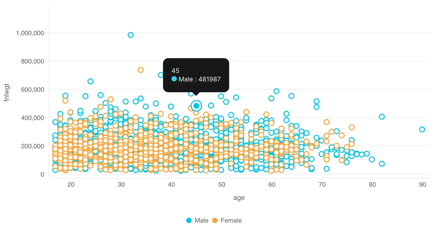
Description:
-
Individual Data Points: Each data point on the chart represents a specific combination of values for the two variables.
-
Cartesian Plane: The chart is based on a Cartesian coordinate system, with one variable plotted along the x-axis and the other along the y-axis.
-
Variable Relationships: Scatter plots help visualize how changes in one variable correspond to changes in the other, indicating potential correlations or patterns.
-
-
BoxPlot
A BoxPlot, also known as a box-and-whisker plot, is a graphical representation used to visualize the distribution, spread, and outliers within a dataset. It provides a concise summary of key statistics, such as the median, quartiles, and potential outliers. The chart comprises a rectangular “box” and lines extending from it, known as “whiskers.”
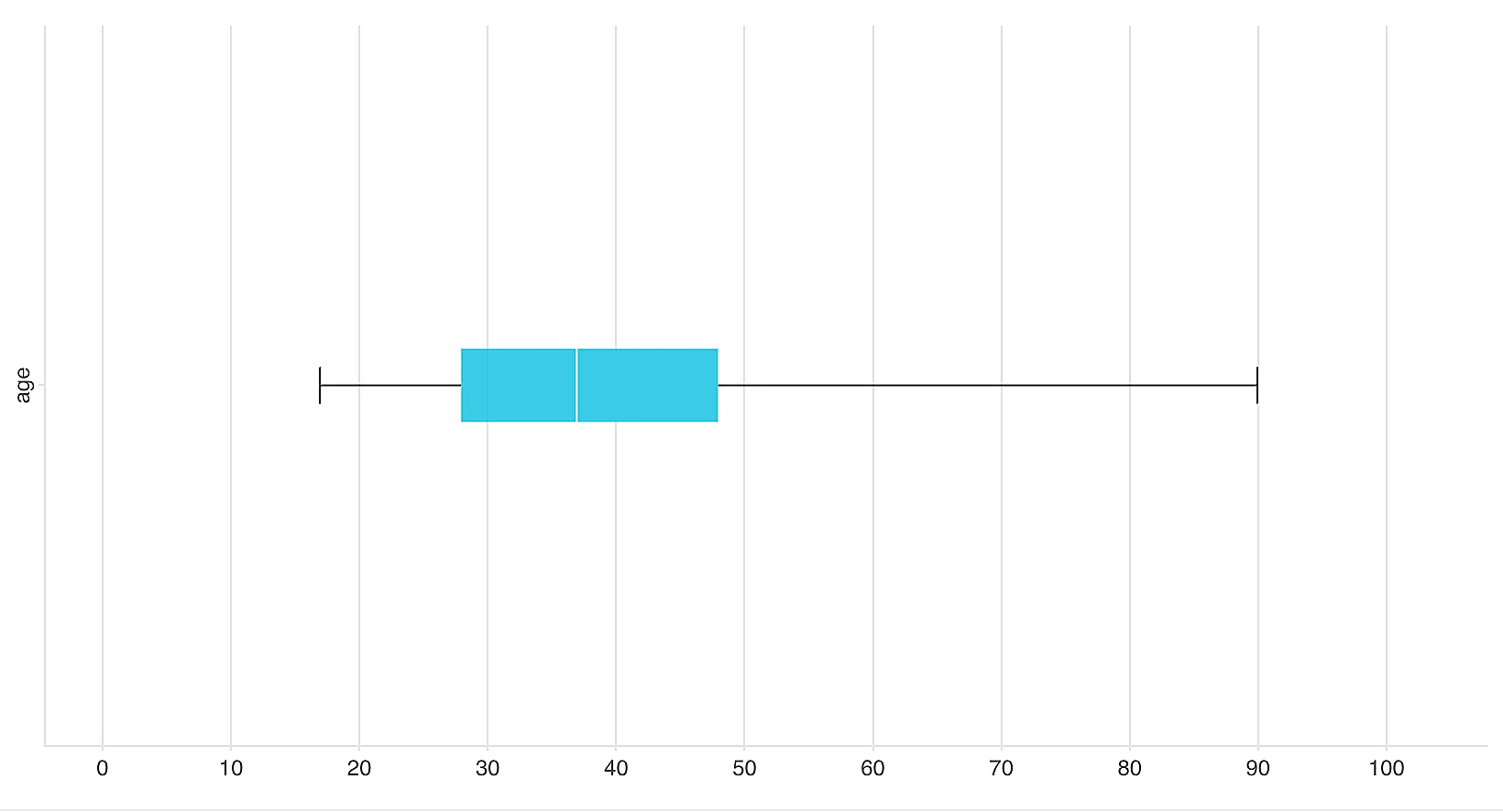
Description:
-
Box: The central rectangle (box) spans the interquartile range (IQR), showing where the middle 50% of the data is concentrated. The box’s vertical line inside represents the median.
-
Whiskers: Lines (whiskers) extend from the edges of the box to the minimum and maximum values within a defined range, excluding outliers.
-
Outliers: Points outside the whiskers are marked as individual data points and can indicate potential outliers.
-
-
Histogram
A histogram is a graphical representation used to visualize the distribution of numerical data. It divides the data into bins or intervals along the x-axis and displays the frequency or count of data points falling within each bin on the y-axis. Histograms help you understand the shape, central tendency, and spread of a dataset.
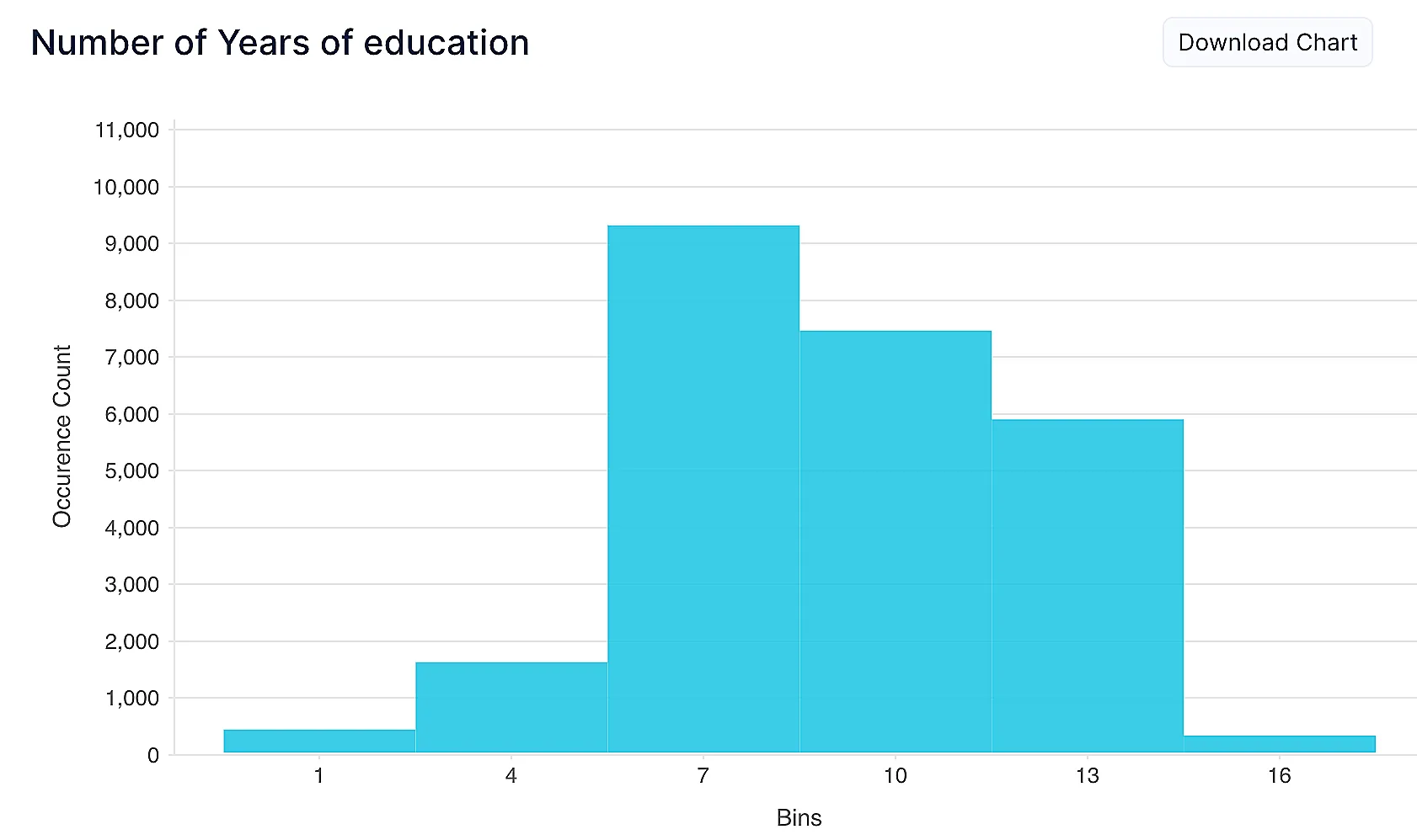
Description:
-
Binning: Data is divided into intervals (bins) along the x-axis, and the y-axis represents the frequency or count of data points within each bin.
-
Bar Heights: The height of each bar corresponds to the number of data points in the respective bin.
-
Shape Interpretation: Histograms provide insights into data distribution patterns, such as whether it’s skewed, symmetric, or bimodal.
-
Last Updated 2025-02-19 15:51:40 +0530 IST
Yes
No
Send your feedback to us