Composition Charts
Composition charts, also known as part-to-whole charts, are graphical representations used to show how individual parts contribute to the whole of a dataset. These charts help display the proportions, percentages, or absolute values of different categories within a larger entity or dataset. Composition charts are particularly effective for illustrating the distribution of data and emphasizing the relationships between different components.
-
Bar Chart
A bar chart is a type of data visualization that represents categorical data with rectangular bars. Each bar’s length or height is proportional to the value it represents. Bar charts are commonly used to compare the frequencies or values of different categories within a dataset. They are particularly useful for visualizing discrete data and understanding patterns or trends in the data.
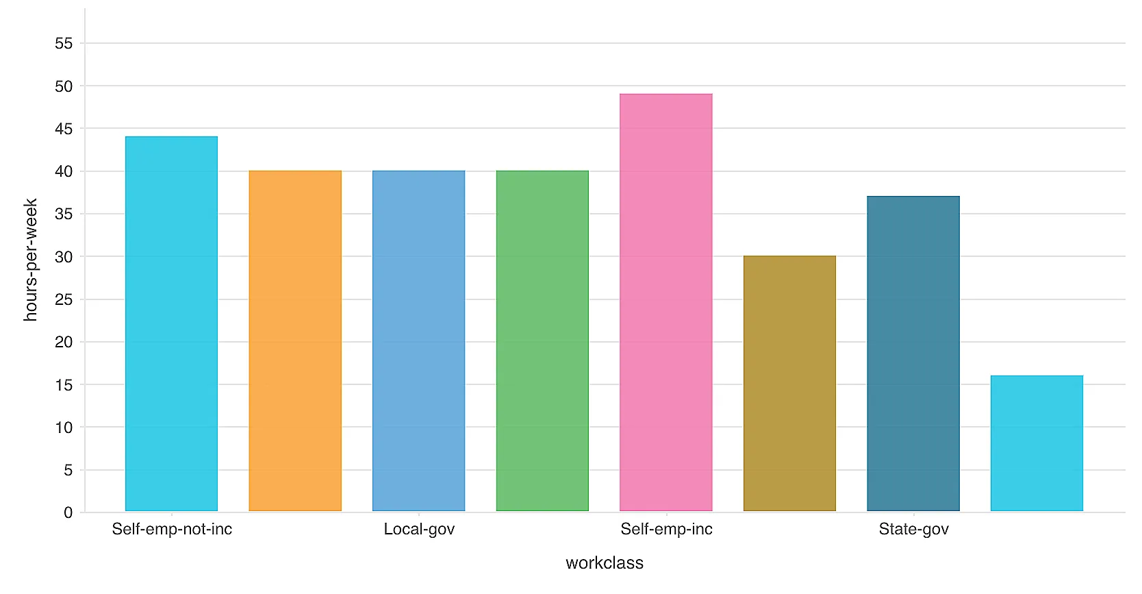
Description:
- Axes: The horizontal axis (x-axis) usually represents the categories, and the vertical axis (y-axis) represents the value count.
- Shape: Each category is represented by a separate bar.
- Sections: Bars are drawn for each category, with their lengths or heights indicating the data values.
-
Pyramid Chart
A pyramid chart, also known as a triangle diagram, is a visual tool used to showcase hierarchies, workflows, or simple datasets. It’s shaped like a triangle divided into horizontal sections. These charts are effective for comparing data, displaying proportions, or illustrating hierarchies and workflows. They’re commonly used in business presentations to show steps taken towards a task, market shares, hierarchy levels, or a sequence of actions.
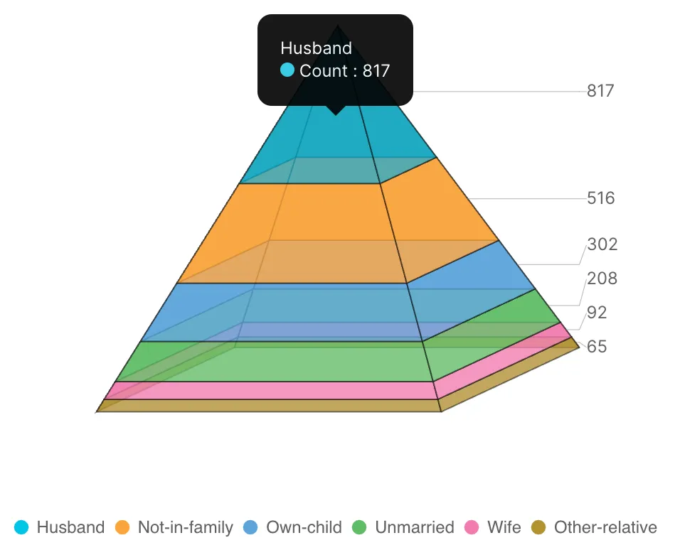
Description:
-
Shape: Resembles an three-dimensional triangle, forming a pyramid-like structure.
-
Axes: Pyramid charts don’t have traditional x and y axes like bar charts. Instead, they rely on the hierarchical structure of the data to convey information.
-
Hierarchy Representation: The layers of the pyramid chart represent different levels of a hierarchy, workflow, or a sequence of actions. The widest layer is at the bottom, and the layers become narrower as they move upward.
-
Sections: The triangular shape is divided into horizontal sections or layers. Each layer corresponds to a category, step in a process, or level in a hierarchy.
-
Width and Height: The height of each layer that indicates the proportion of a category. The width of the layers doesn’t carry a specific meaning.
-
-
Pie Chart
A pie chart is a circular visualization used to display categorical data as a set of “slices.” Each slice represents a specific category’s proportion within a whole. The size of each slice corresponds to the percentage of data it represents. Pie charts are valuable for showcasing parts of a whole and comparing relative contributions of different categories.
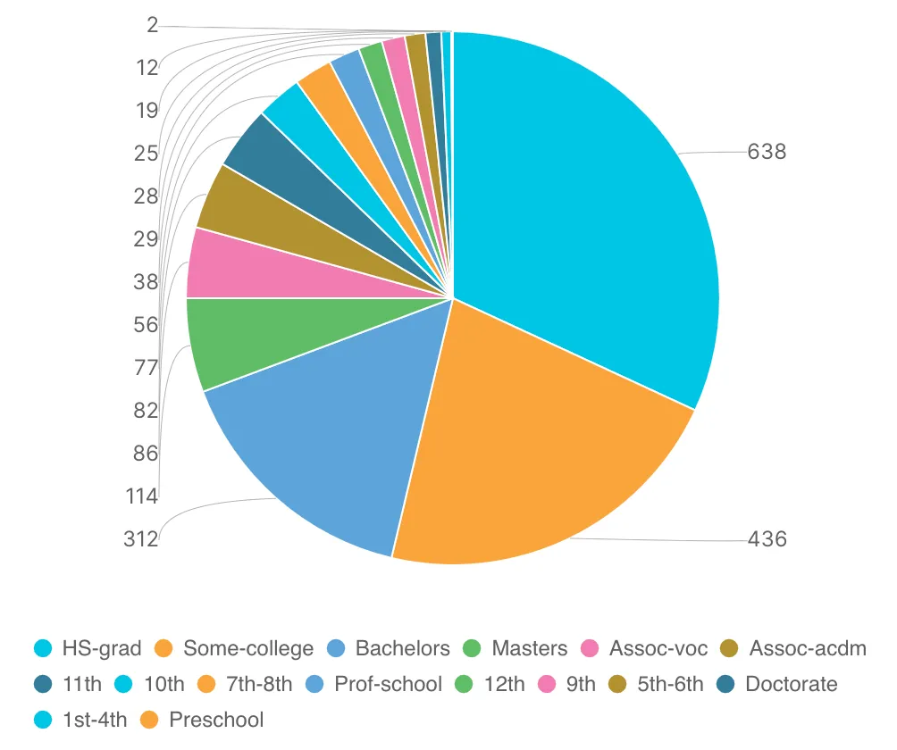
Description:
-
Circular Shape: A pie chart is circular, resembling a full pie. The entire circle represents 100% of the data.
-
Slices: The circle is divided into slices, with each slice representing a specific category or data point.
-
Proportional Representation: The size of each slice is proportional to the percentage it contributes to the whole data set. Larger slices indicate higher proportions.
-
-
Stacked Bar Chart
A stacked bar chart is a graphical representation used to show how different components contribute to a whole, while also comparing the contributions of multiple categories across different groups or segments. Each bar in the chart is divided into segments, with each segment representing a specific category’s contribution. The total height of each bar indicates the combined contribution of all categories, while the segments show the distribution of contributions within each bar.
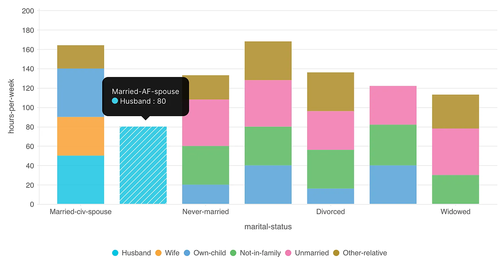
Description:
-
Segmented Bars: Bars are divided into segments, each representing a category.
-
Vertical Structure: Bars are aligned vertically, with the y-axis representing value count and the x-axis showing different groups or segments.
-
Contribution Comparison: Stacked bars allow for comparing the contributions of different categories within each group and across multiple groups.
-
-
Stacked Area Chart
A stacked area chart is a visual representation used to showcase the cumulative contributions of multiple categories or groups over time. It’s built upon the same principles as a regular area chart, but with multiple areas stacked on top of each other. Each area represents a category, and the combined height of the areas at any point on the chart reveals the total value at that point.
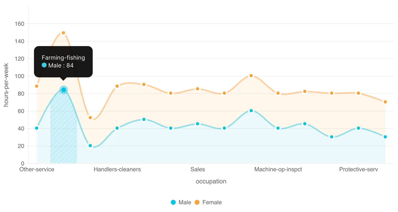
Description:
-
Layered Areas: Areas are layered on top of each other, with each layer representing a category or group.
-
Axes: The x-axis represents different categories or groups, and the y-axis represents the cumulative value of the data points within those categories.
-
Cumulative Visualization: The chart illustrates how the contributions of different categories accumulate to form the whole over time.
-
Last Updated 2025-02-19 15:51:40 +0530 IST
Yes
No
Send your feedback to us