Comparison Charts
Comparison charts are graphical representations used to compare data between different categories, groups, or time periods. They provide a visual way to highlight similarities, differences, trends, and relationships within datasets. Comparison charts are particularly effective for making data-driven decisions, identifying patterns, and conveying insights through easy-to-understand visualizations.
-
Area Chart
An area chart is a graphical representation used to showcase the change or distribution of a dataset over time or along a continuous axis. It resembles a line chart, but the area between the line and the x-axis is filled, providing a visual depiction of the cumulative values. Area charts are particularly effective for revealing trends, comparing multiple datasets, and emphasizing the total values over time.
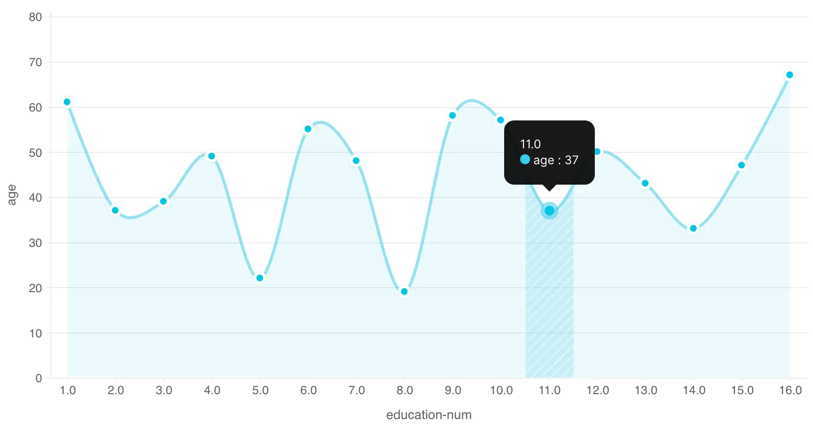
Description:
-
Filled Area: Represents data using filled areas bounded by lines, visually emphasizing the cumulative or individual values over time or other continuous axis.
-
Axes: The x-axis of an area chart represents the distinct categories, groups, or timeperiods , while the y-axis represents the contributions associated with each category or time periods
-
Trend Visualization: Area charts help display trends, changes, or distributions of data over time or along a continuous axis.
-
-
Grouped Bar Chart
A grouped bar chart is a graphical representation used to compare values of multiple categories across different groups or segments. It displays bars for each category within each group, allowing for direct comparisons between categories within the same group and across various groups. Grouped bar charts are effective for illustrating patterns, differences, and relationships in dataset values.
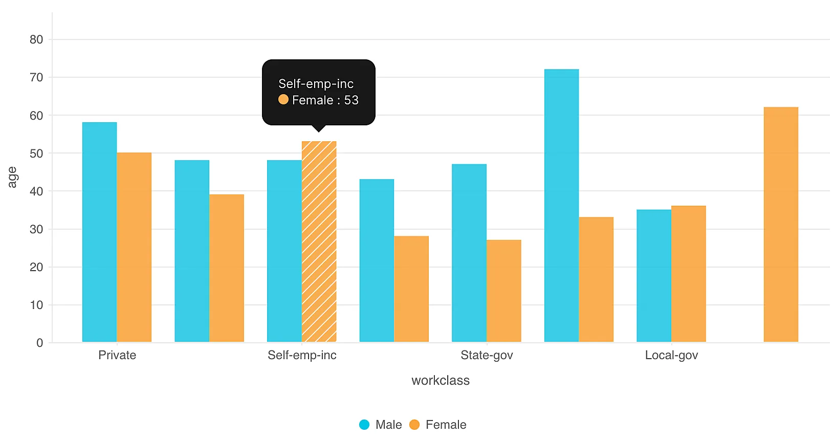
Description:
-
Bar Groups: Bars are grouped side by side for each category, and each group represents a distinct segment or category.
-
Vertical Structure: The chart is arranged vertically, with the y-axis representing values and the x-axis indicating the groups or segments.
-
Comparison: Grouped bars allow for easy visual comparison of values within categories across different groups.
-
Last Updated 2025-02-19 15:51:40 +0530 IST
Yes
No
Send your feedback to us