Chart Insights
Chart Insights for Data Visualization
QuickML includes a Chart Insights feature that generates key insights in natural language based on visualizations created during data analysis. This helps you interpret and explore the underlying dataset by providing meaningful explanations for each chart.
These insights are generated using the Qwen 2.5 - 7B Vision Language model, a powerful 7-billion-parameter multimodal model designed to understand both text and images. It excels in reasoning tasks and is primarily used to generate accurate outputs based on images uploaded by the end-user. By clicking the Chart Insights icon next to any chart, a side panel will open, presenting key insights and explanations about the selected chart. Within this panel, you can also choose to either copy the generated explanation or regenerate it, letting you refine the insights as needed. This feature provides a deeper understanding of the visualized data without requiring additional manual analysis.
The Chart Insights can be accessed in two places:
While creating a chart
During chart creation, you will find an option to Generate Key Insights. This displays the newly created chart along with its auto-generated explanation.
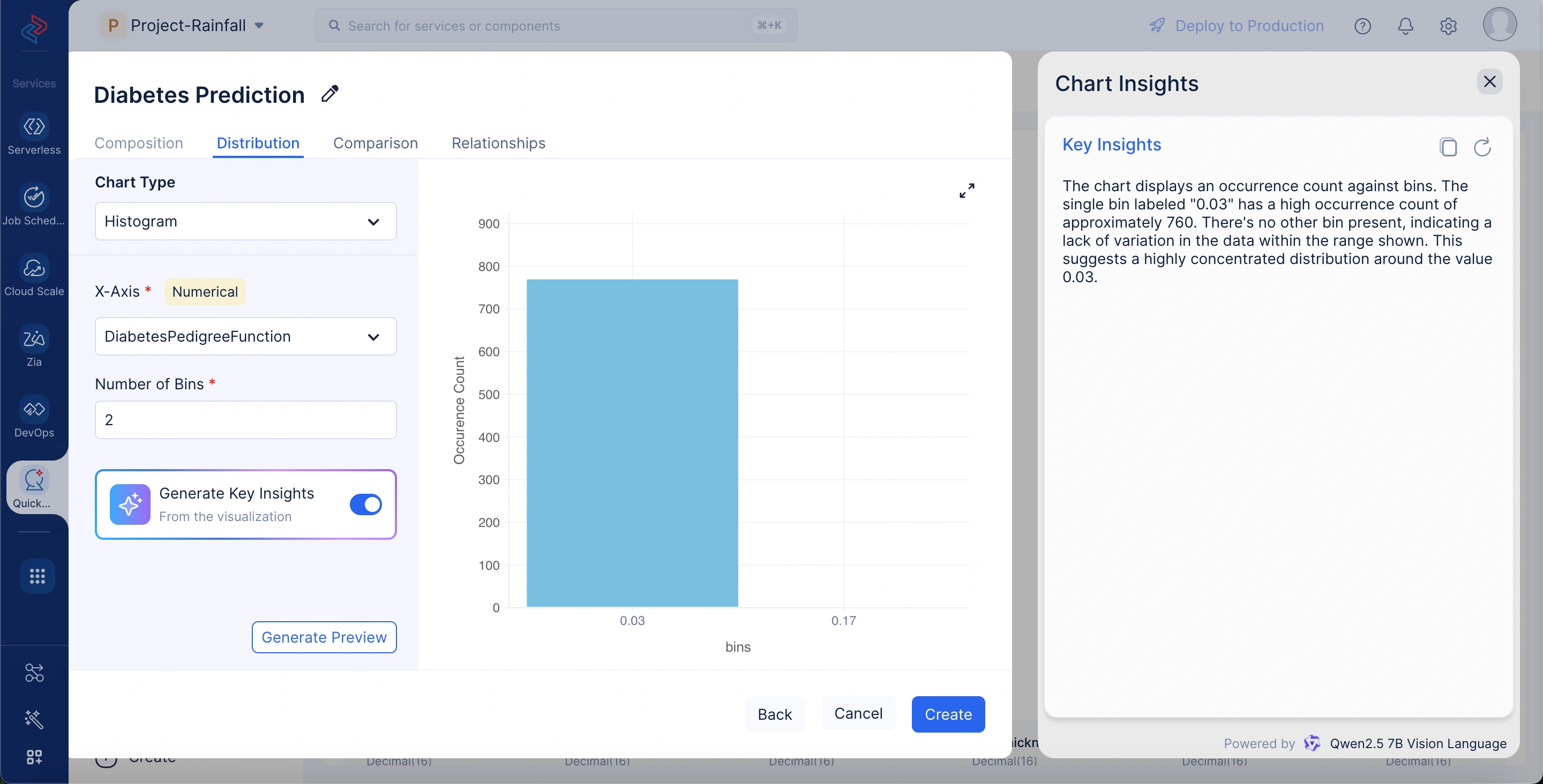
In the displayed histogram for the DiabetesPedigreeFunction attribute, the chart shows the occurrence count against bins. The single bin, labeled around 0.03, exhibits a high occurrence count of nearly 760. No other bins are present, indicating a lack of variation in the data within the shown range. QuickML’s Chart Explainer interprets this as a highly concentrated distribution around the value 0.03, suggesting that most records cluster tightly at this point with minimal spread across other values.
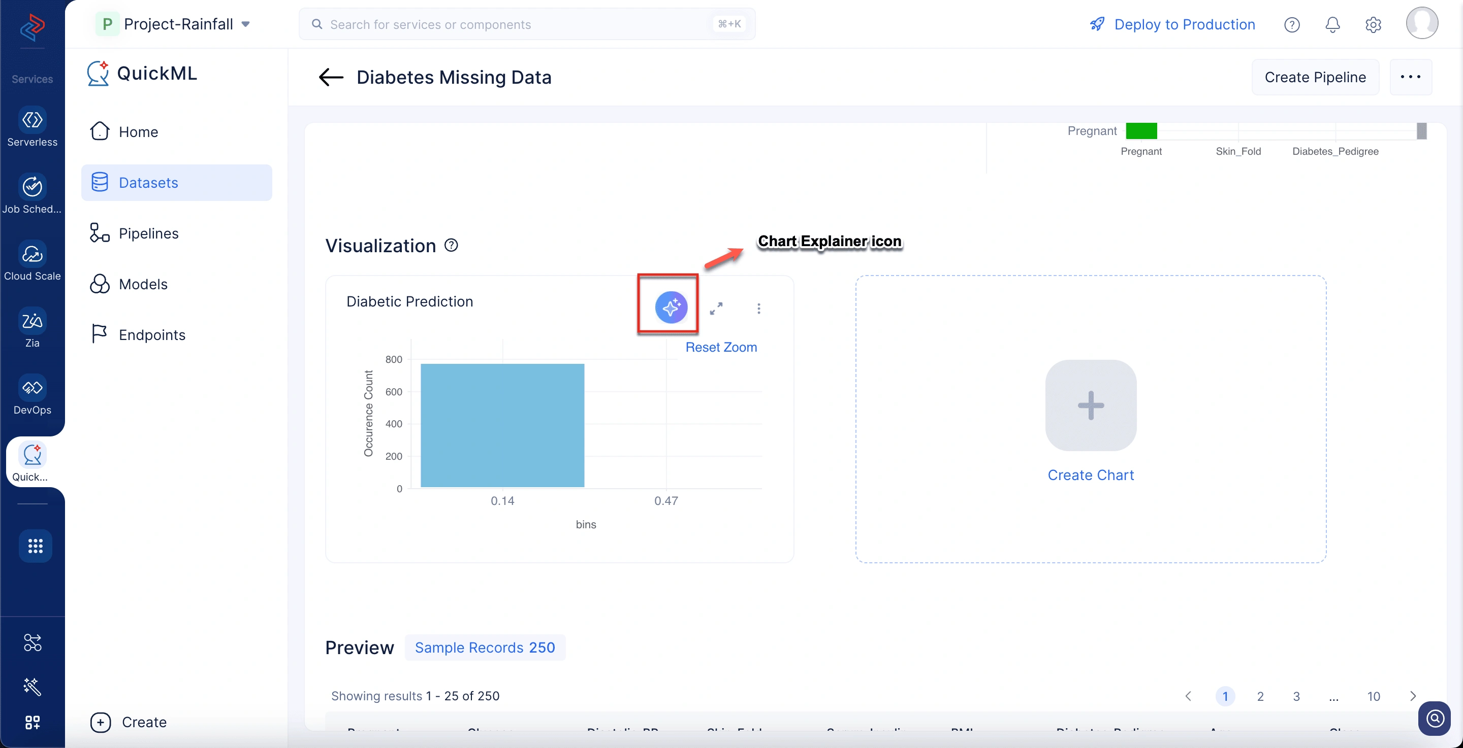
After chart creation
In the Visualization section, you can view explanations for previously created charts. Here, the model provides a breakdown of key points and insights related to the chart.
Last Updated 2025-09-08 16:55:49 +0530 IST
Yes
No
Send your feedback to us